
I have been working some more on my graphic novel these past two weeks. Essentially it boils down to the preparation and illustration of the first two pages, as well as some overall planning of the comic.
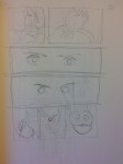
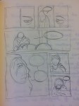
Moving on from my vague outline and monologues, I started to plan out thumbnails for the first few pages. I prefer to go straight to thumbnails rather than script out each page, as I feel this gives a better flow to the narrative in visual storytelling. Especially considering I want the first 5 or so pages to be near wordless, it was important that plot, mood, atmosphere, and character were conveyed through visual storytelling.
Before thumbnailing, I drew up a list of each page and what would occur on each. This was important so that I could keep the narrative moving forward and not finding myself lost in the atmosphere of each page, stalling the flow.


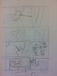
Whilst I was happy with the layout of the first page in the first thumbnail above, I was unhappy with the flow of the eyeline – starting at the crow, cutting left to follow the words, and then down through the page. I redrew this thumbnail a second time, and felt I had better achieved the flow of the page. I also realised that I needed some practice drawing crows, so I did the following ink drawing to practice.

For the second thumbnail, I was unhappy at the speed of the pace, and the immediacy of the violence – the knight killing the deer seemed somehow, too bombastic. I made the choice to have him miss the deer with his arrow, and split it over pages 2 and 3. This resulted in me re-thumbnailing pages 2-3, as well as continuing thumbnailing through page 6.
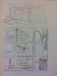
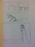
I was much happier with the flow of this sequence – I felt it built suspense better, the dread atmosphere, but also kept the restrained touch that I want this graphic novel to have. I also thumbnailed through the next scene – a young boy is killed by soldiers for hunting on their grounds. The knight has the opportunity to intervene, but instead does nothing. This is then followed by a solemn moment when the knight looks down on the boy’s corpse – this will be important for a later flashback, and will be a visual touchstone for the knight’s loss of faith and his fall from grace. The last page has the old man arriving – I know not what he will say yet, but I know he will have a dialogue with the knight about the boy, whom he knew, before inviting him back to his hut. The old man realises this knight didn’t kill the boy, as the boy’s throat was cut with a blade, and the knight doesn’t have any blades on him.
I have since drawn the first two pages of the graphic novel, and I am very happy with the results.
At this point, as the themes, style, and imagery of the book began to coalesce, I became worried about the structure of the book, which I only knew of vaguely. I have a three act structure in place – the first act being the knight with the old man, the second act being the knight with the demon, and the third act being a chase sequence – but I felt I needed another structure to rely on. I also had no title in mind so if I could find something biblical and ominous that would be best!
After some research I came across two biblical concepts that I felt would fit my theme, that I could invert their traditional meaning into something bleaker. The first is Etimasia. I came across it from this piece of music, by lutist Jozef Van Wissem and film director Jim Jarmusch on the electric guitar (it’s also a kick-ass song that really fits the mood I’m going for with this book):
Etimasia, or Hetoimasia, is a common concept found in religious iconograpghy, of an empty throne. Specifically for Christian religions, after the Byzantine era it came to be known as a throne prepared for the Second Coming of Christ. What is a more perfect symbol of moral imbalance? As the book is about a morally compromised universe and the impossiblity of an ethical existence in such a universe, the wait for a second coming is something that would be comforting, but when faced with the possibility that this throne will never be filled because God doesn’t exist, this icon becomes terrifying. One possible title down.
However, on further research I found another concept that I felt fit my theme a bit closer than Etimasia (though I may save that title for a chapter name, if I end up splitting the book or serialising it). This concept is the Stations of the Cross – the 14 moments of Jesus’s execution and crucifixion. Not only does it fit in with sequential art, with a long history of artistic depictions, but I also felt that I could mirror these stations quite easily with my narrative, paralleling them in the knight’s journey. However, I wouldn’t want to whack the reader over the head with these references, so I have mirrored them in spirit but not replicated them exactly. There will be no reference to the crucifixion in the book itself, so the reader will be left with the title and left to discover the meaning for themselves. Rather than depicting the fall of Jesus and his sacrifice, I hope to emphasise the meaningless of such a sacrifice in an amoral reality. The knight’s quest will be futile.


Loving your process here! Excellent choice to leave out the specifics and let each reader discover their own meaning, keep it up!
LikeLike
Thanks Rodders for reading and leaving your kind feedback! Can’t wait to share more with you 🙂
LikeLike